
Cohort Analysis: Tracking True Profitability by Acquisition Month
· 17 min read · By Rocktomic Labs Team

A cohort analysis groups every customer by the month they first bought, then tracks their cumulative profit over time. Within 12 months you can see exactly which marketing channels deliver high-LTV buyers and which quietly lose money.
This guide walks a supplement brand owner through the full workflow: the metrics, the build, the math, and the budget decisions.
What Is a Cohort Analysis?
A cohort is a group of customers who share one event: the month of their first purchase. A cohort analysis follows each monthly group over time and measures profit at 30, 60, 90, 180, and 365 days. It is the only way to see whether customers acquired in one month behave differently from those acquired in another, because each group gets its own profit curve instead of a blended average. Time-based cohorts can also be sliced by channel, product, or campaign (Peel Insights, Aug 28, 2025).
Pick any product, set your monthly volume, and see your real per-unit and monthly profit on every plan – fulfillment, card processing, and membership all included.
Why Average LTV Lies to Supplement Brands
Blended lifetime value looks clean: average order value times purchase frequency times customer lifespan. One number. That is exactly the problem.
That single number mixes a one-time buyer who used a 40% off code with a subscriber who reorders every 30 days for two years. Those two customers have nothing in common, yet the blended LTV treats them as the same person. Every acquisition decision you make off that number is a guess.
The Pareto Pattern Hides Inside the Blended Average
Most supplement brands see a rough 80/20 split: about 20% of customers drive most of the profit, and a blended average buries that. It tells you every customer is worth the same, so you spend like the average buyer is profitable. You discover the decay only after the ad budget is gone. Two very different revenue curves collapse into one flat line, and that flat line is what you plan around.
Run a concrete example. A Q4 promo cohort acquired at a steep discount can post a strong blended first-month revenue number. Then it decays. The reorder rate drops, second and third orders never show up, and the discount eats the margin.
An organic cohort of the same size quietly produces more second and third orders at a higher contribution. Same blended math at first glance. Very different profit 90 days later.
Acquisition is too expensive to guess at. If your LTV number hides cohort decay, you are scaling a channel that loses money and cutting one that prints it.
Which 5 Metrics Define Cohort Profitability?
Five numbers decide whether an acquisition month was worth it. Define them the same way every month, or your cohort comparisons go soft.
Run LTV on gross profit, never revenue. Revenue ignores product cost and the fulfillment fee on every order. Fix the window too, at 12 or 24 months, so every cohort gets measured for the same length of time.
The table below shows the five metrics, the exact formula, and what each one signals.
| Metric | Formula | What it signals |
|---|---|---|
| Repeat purchase rate | Customers with 2+ orders / customers in cohort | Whether a second order happens |
| Cumulative gross profit per customer | Sum of (order revenue – COGS – fulfillment) across all orders | True cohort earnings |
| Cohort LTV | Cumulative gross profit per customer over a fixed window (12 or 24 months), gross profit basis, never revenue | Long-term value of the cohort |
| LTV:CAC | Cohort LTV / customer acquisition cost for that cohort | Acquisition efficiency |
| CAC payback period | Months until cumulative contribution exceeds CAC | Cash flow strain |
Benchmark: a ratio below 2:1 is unsustainable. A ratio of 3:1 or higher is healthy, per Eightx (Jun 22, 2026).
That 3:1 target is gross profit, not revenue. The cohort needs to return three dollars of contribution for every dollar spent acquiring it. At 2:1, you’re treading water; below that, every new customer pulls you further behind.
Watch repeat purchase rate first. A second order is the event that makes the cohort’s cumulative gross profit curve bend upward. Then watch CAC payback period, because a long payback strains cash flow even when the cohort looks profitable on paper.
Run your real numbers through the LTV calculator for supplement brands and check each cohort against these five metrics. The pattern will show up in months, not years.
How to Build a Cohort Table From Your Order Data
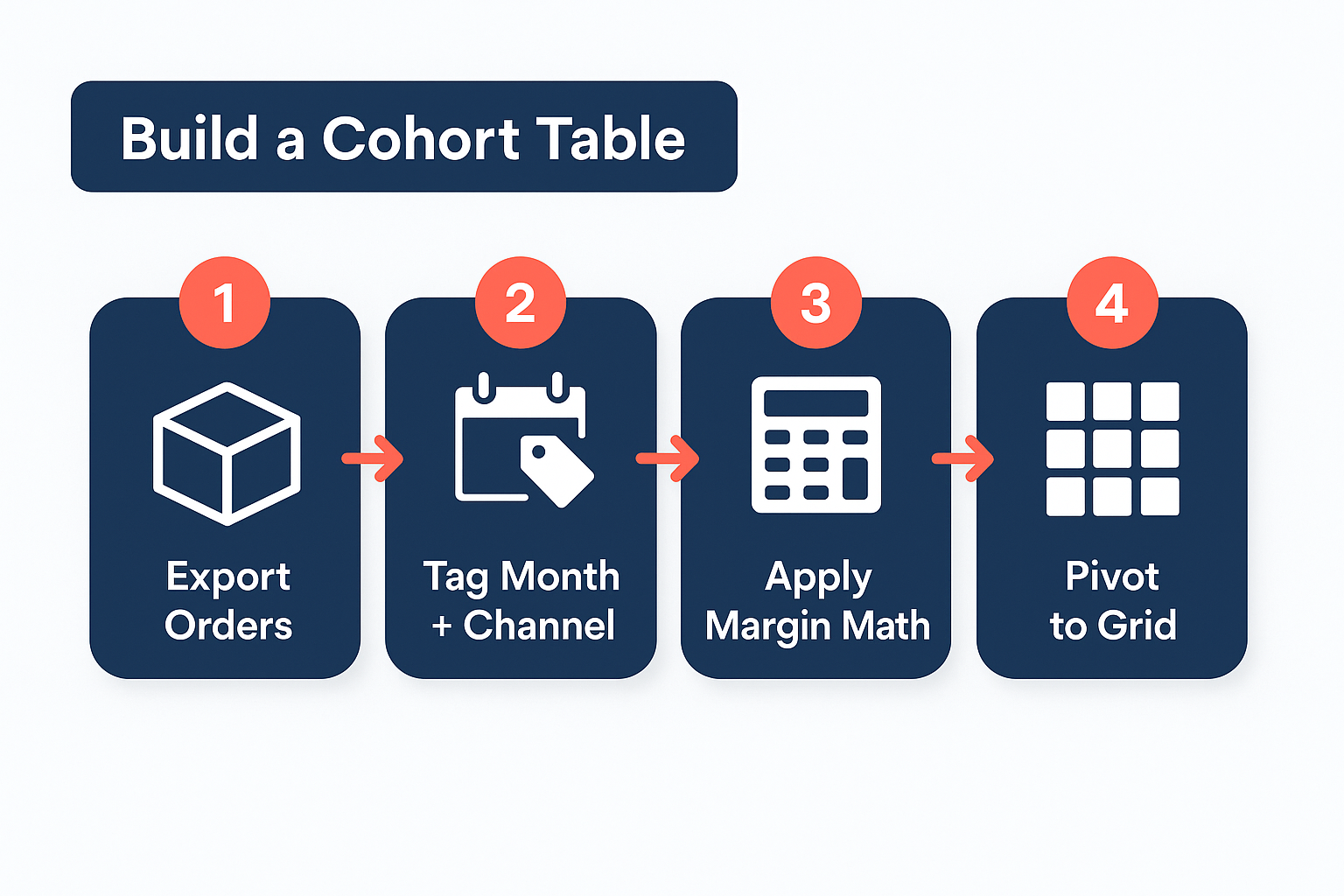
You do not need a data team for this. Four steps, a Shopify export, and a Google Sheet get you a cohort grid that tracks real profitability by acquisition month.
Step 1: Export Your Order History
Pull every order with four fields: customer ID, first-order date, first-order channel, and order revenue. Shopify’s native order reports export this as a CSV in a couple of clicks. If a customer bought three times, you want all three orders. Each row is a purchase event, not a customer.
Step 2: Tag Each Customer With Acquisition Month and Channel
Take the customer’s first-order date and turn it into an acquisition month (2025-01, 2025-02). Take the first-touch channel and use that as the acquisition channel. Now every downstream order carries that customer’s original source, so revenue always rolls up to the month that acquired the buyer. This tag is what makes the pivot possible.
Step 3: Assign a Contribution Margin Per Order
Each order needs a margin: revenue minus COGS minus fulfillment. Part 6 locks in the formula, so for now just keep it as a per-order number you can sum. You are building the table, not debating the math.
Step 4: Pivot Into a Cohort Grid
Rows are acquisition months. Columns are periods since acquisition: 0, 30, 60, 90, 180, and 365 days. The January cohort row starts with period 0 populated from January orders. February adds the 30-day column, and the rest fill in as the year runs. Google Sheets pivot tables build this grid in a few clicks from your tagged export.
Clean Channel Attribution First
Shopify defaults to last-click, which credits the final touchpoint, not the channel that actually acquired the customer. That silently misallocates every cohort row. Connect store integrations for clean order data so each order carries the right source from day one.
Once the grid fills in, the rows tell you which acquisition months produced buyers who keep coming back. That is the signal your channel spend decisions run on. A cohort row that climbs after period 90 is worth more than one that flatlines.
The Money Math: One SKU, Two Cohorts
Same product. Same price. Same fulfillment. The only difference between these two cohorts is the channel that delivered the customer. That difference is worth thousands a year.
Here is the canonical SKU this article runs on. Every later number in this article traces back to it.
| Item | Value |
|---|---|
| Product | Ashwagandha (ROC822) |
| MSRP | $29.97 |
| Scale wholesale (COGS) | $5.37 |
| Fulfillment per item | $2.00 |
| Contribution per order | $22.60 |
| Contribution margin after fulfillment | 75.4% |
That $22.60 is the number every LTV below depends on. It starts at MSRP, subtracts the $5.37 wholesale cost on the Scale plan, then subtracts the flat $2 per item fulfillment fee. Rocktomic picks, packs, labels, and ships for that flat fee, so your contribution stays predictable order after order. Run your own numbers with the supplement margin calculator before you commit spend to any channel.
Contribution per order is the cleanest number a supplement brand can track. It strips out marketing spend entirely and answers one question: after production and fulfillment, how much of that $29.97 sale is actually yours? Every later LTV figure in this article uses $22.60 as its base, so the math stays audit-ready.
| Metric | Paid social | Email plus organic |
|---|---|---|
| CAC | $40.00 | $12.00 |
| Orders per customer | 1.3 | 2.6 |
| LTV (12 months) | $29.38 | $58.76 |
| LTV:CAC | 0.73 | 4.9 |
| Payback | None within 12 months | Month 1 |
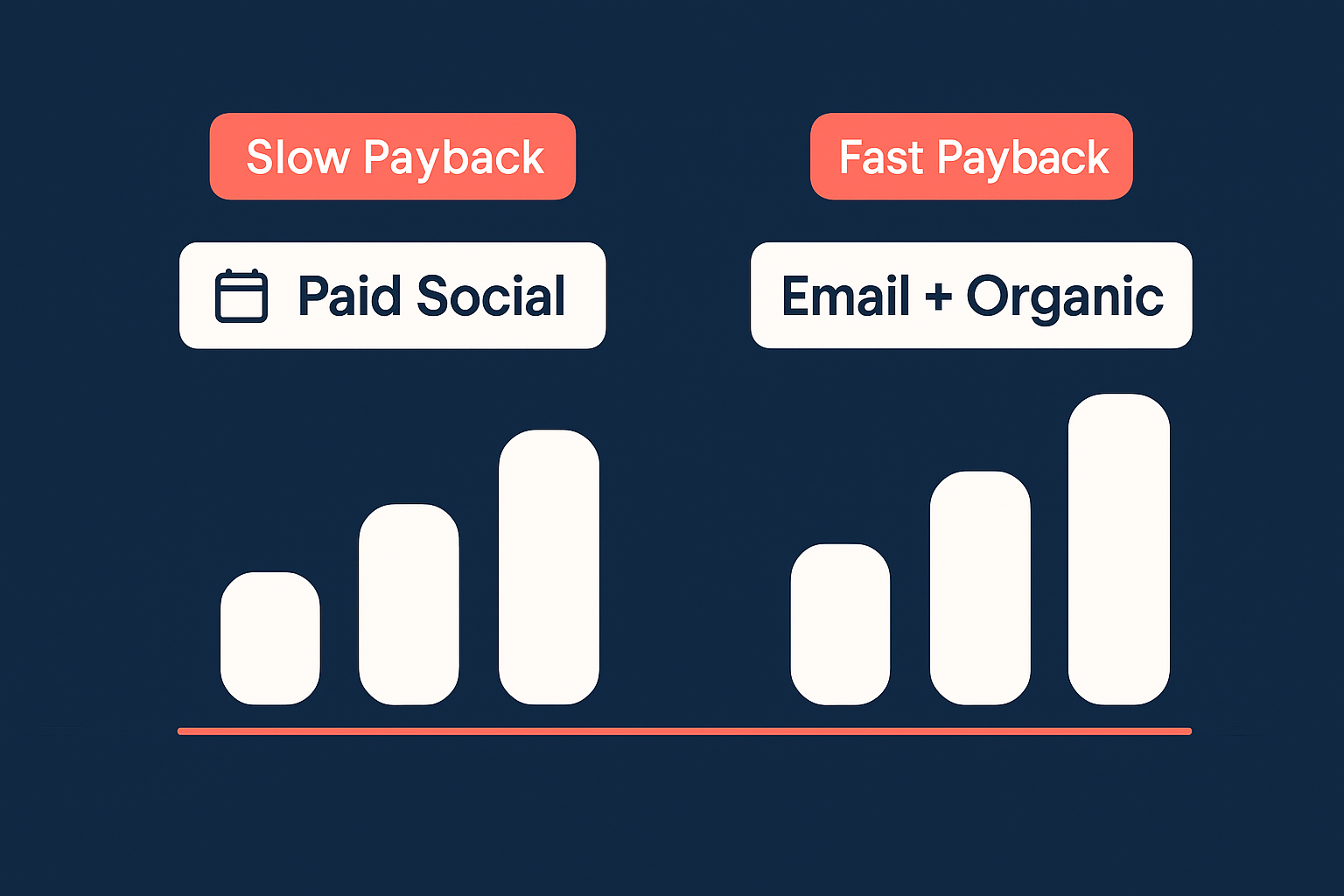
Every LTV figure in Table B is $22.60 x orders per customer. No other SKU, no blended margin, no member numbers. $22.60 x 1.3 = $29.38. $22.60 x 2.6 = $58.76. The assumptions are deliberately simple, and the cohort ages match on both sides.
Now the trap. Blend the two channels together and the picture looks acceptable. One channel with strong returns hides another channel that loses money on every customer it brings in. The cohort view separates them: paid social spends $40 to get back $29.38, so it never pays back within 12 months. Email plus organic spends $12, gets back $58.76, and pays back in month 1. Blend the two and you lose the signal. Keep them apart and you know exactly which channel to fund.
Look at your acquisition months the same way. A healthy-looking blended number is usually one channel quietly funding another.
How to Read the Table: 3 Signals That Change Budget Decisions
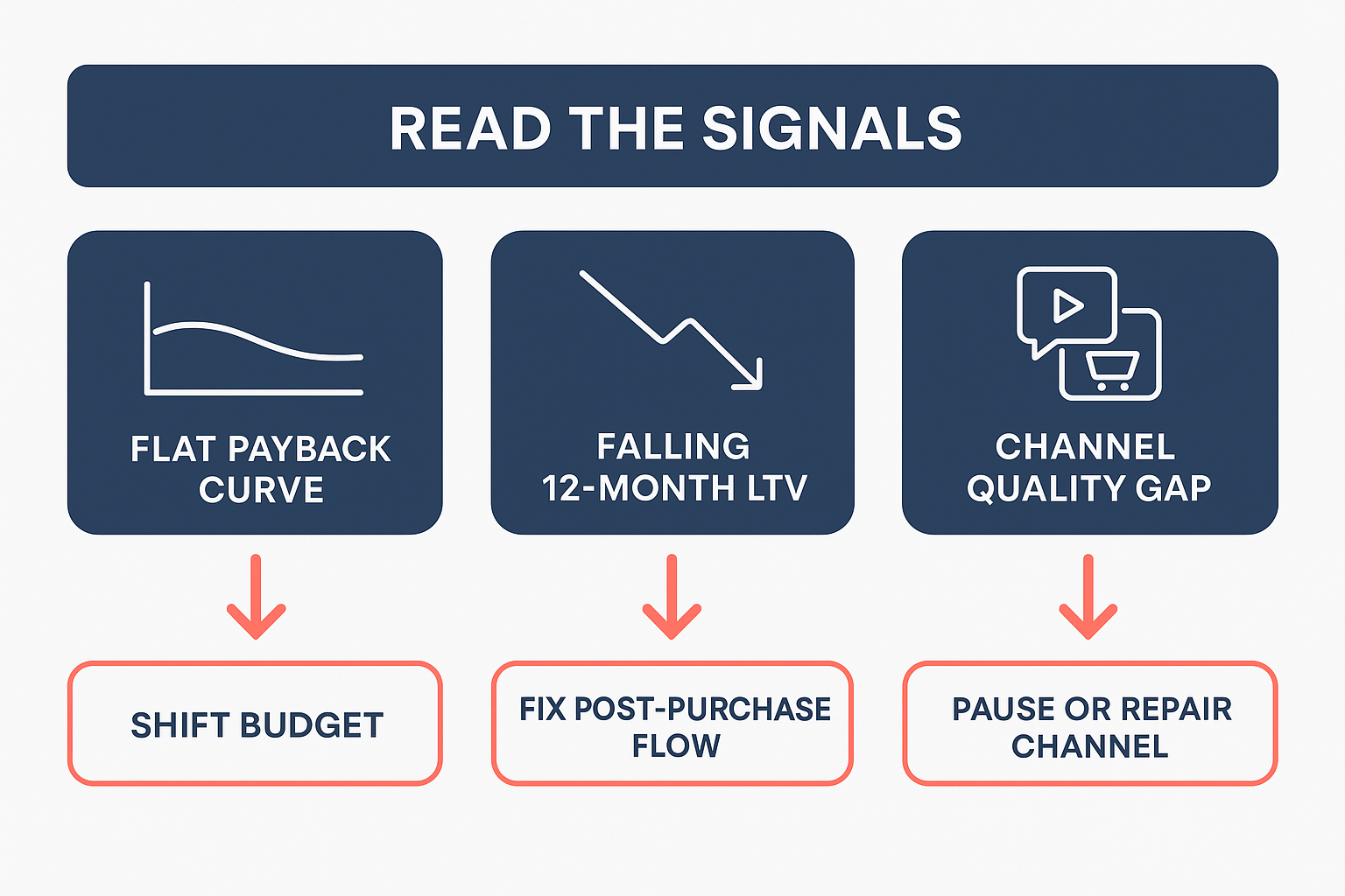
Three rows in a cohort table should change your ad budget this week. The rest of the table is context. Look for these three signals first, then act on each one before you set next month’s spend.
Signal 1: A flat payback curve
When recent cohorts pay back on the same schedule as older ones, your acquisition dollars stay tied up longer. Long-term LTV math can still look fine, and that is exactly what hides the working capital trap. Your cash sits in inventory and ad spend instead of funding the next campaign. Every month of payback delay is a month that dollar cannot be reinvested.
Action: shift budget to the cohorts that pay back fastest. Faster payback means more capital cycles per year, and more cycles mean more tests and more total profit from the same cash.
Signal 2: Declining 12-month LTV
Consecutive cohorts with lower 12-month LTV tell you customer quality is slipping. Discount depth usually causes it. So does a channel mix change that pulls in lower-intent buyers. Scaling the worse cohort locks in the decline and makes each new cohort look weaker than the last. The problem is not acquisition volume. It is what happens after the first order.
Action: fix the post-purchase flow before spending another dollar on acquisition. Improve onboarding emails, subscription experience, and product follow-through first. If retention is the weak point, review subscription retention economics to see exactly where customers drop off.
Signal 3: A wide channel quality gap
The channel with the highest first-order ROAS is rarely the channel with the highest LTV. The cohort table shows that gap in months, not in first-order margin. When the gap widens, you are buying transactions, not customers. That channel inflates your dashboard today and drags your retention next year. Healthy brands let cohort LTV, not first-order ROAS, decide the budget.
Action: pause the high-ROAS, low-LTV channel, repair the offer or the targeting, then reallocate that spend to the faster-payback cohort.
What Healthy Supplement Cohort Benchmarks Look Like
Benchmarks exist to tell you whether you’re in the right neighborhood. They are not targets. Your own cohort-over-cohort trend is the real standard, because it already accounts for your offer, your price, your audience, and your fulfillment economics.
Published data gives you a useful starting point.
| Metric | Value | Source |
|---|---|---|
| Blended DTC repeat purchase rate | 28.2% | Shopify, Jan 5, 2025 |
| Supplements repeat purchase rate, Shopify data | About 29% | Shopify, Jan 5, 2025 |
| Profit lift from cutting defections 5% | 25% to 85% in named cases | Reichheld and Sasser, Harvard Business Review, Sep-Oct 1990 |
Read benchmarks as direction checks
Notice what these numbers actually say. Blended DTC lands at 28.2% repeat purchase. Supplements sit slightly higher, near 29%. Treat those as course corrections, not pass/fail grades. A brand doing 22% repeat purchase with an improving trend beats a brand doing 35% with a declining one. The trend is the signal.
The defections figure matters even more. Reichheld and Sasser found that cutting defections 5% lifted profits 25% to 85% in the cases they studied. That study is old and the range is wide, but the direction holds: retention compounds. A small gain in cohort 2 or 3 repeat rates flows straight to the bottom line.
No benchmark set is universal. A subscription greens brand runs different retention than a one-off pre-workout brand. That’s exactly why your cohort trend beats any published average. The benchmark tells you which direction to look; your own data tells you what’s actually happening.
So read your cohorts the same way, every month. Compare month over month, channel over channel. If a channel’s cohort 3 repeat rate keeps climbing, that channel is earning more spend. The 3:1 LTV to CAC rule is how you judge whether those cohorts justify their acquisition cost – read the 3:1 LTV to CAC rule for supplements for the math.
3 Mistakes That Ruin Cohort Analysis
A cohort table is only as trustworthy as the choices made before the first row renders. Three errors corrupt the output more than any others, and all three are preventable. Fix these and your acquisition-month numbers actually describe your business.
Mistake 1: Mixing Subscription and One-Time Buyers
Subscription and one-time buyers follow different curves. A subscriber pays you monthly and builds value over time; a one-time buyer pays once and may never return. Pool them into one cohort and the average flattens two distinct profit curves into a number that describes nobody. It also hides which purchase model your best channel actually drives. Split cohorts by purchase model before calculating retention or LTV.
Mistake 2: Using Revenue Instead of Gross Profit
Revenue flatters. An example order at $29.97 in revenue leaves roughly $22.60 in contribution after COGS, fulfillment, returns, and discounts. Compare channels on revenue and you reward whichever channel spends the most, not the one that profits the most. Returns hit one channel harder than another; discounts inflate one campaign and not the next. Contribution per order captures all of it, so build every cohort on that number.
Mistake 3: Reading Immature Cohorts as Final
A 90-day window requires 90 days of data. With two months of history, your newest cohorts are incomplete, and treating them as final punishes channels with slower payback. The discount trap is the classic version: a promo-driven cohort looks strong at day 30 and decays hard by day 180. A channel that acquires fast can look weak at two months and strong at six. Label immature cohorts clearly, or your next budget meeting will rely on fiction.
The 90-Day Review Ritual
Turn your cohort data into a repeatable habit. Two rhythms matter: a monthly snapshot and a quarterly deep dive. Together they turn raw numbers into decisions.
The monthly 5-minute snapshot
Once a month, re-read your newest mature cohort. Note any change in payback against last month’s read. A drift of a few days tells you which way your acquisition economics are moving before it costs you real money. Five minutes, one number, one note.
The quarterly deep dive
Every quarter, reallocate budget across channels and re-baseline your CAC targets. Run the shift through the profit projection tool first, then commit.
Three decision triggers keep the ritual honest:
- Promote: the channel whose latest 12-month cohort shows rising LTV:CAC gets the next dollar.
- Fix: first-to-second-purchase rate below 15% means the flow needs work, not the ads.
- Pause: a cohort still in negative payback at month 12 is a signal to stop.
A zero-inventory model makes this ritual fast. How on-demand fulfillment works at Rocktomic means you shift budget between SKUs with zero inventory risk and a flat ~$2/item fee. No pallets in a warehouse forcing you to keep pushing a losing product.
Subscriptions built on consumables compound cohort value. A monthly reorder turns one acquisition cost into recurring revenue, which is why customer retention value in supplement brands matters as much as the first sale.
The ritual repeats: read the cohort, act on the trigger, reallocate. Monthly snapshots keep you honest. Quarterly deep dives keep you ahead.
FAQ: Cohort Analysis and Supplement Brand Profitability
What is a cohort analysis?
A cohort analysis groups customers by the month they first ordered, then tracks how that group performs over time. For a supplement brand, the group is the acquisition cohort, and the metric is repeat purchases. The point is simple: a March customer is not the same asset as an October customer. One may buy twice; the other may buy eight times. Splitting revenue by cohort shows which customer groups carry the brand’s profit and which ones drag on it.
Why does acquisition month matter for supplement brand profitability?
Acquisition month decides which marketing spend was worth it. A cohort that buys once can look profitable on day one, then lose money once ad costs and fulfillment fees are counted. A later cohort might convert at a lower rate yet produce more revenue across the year because those customers reorder. When a brand compares cohorts by month, the differences become visible. Profitability is not what a channel spent this week; it is what that week’s customers did for the next twelve months.
How do you calculate contribution per customer in a cohort?
Start with revenue per customer. Subtract product cost, fulfillment, and platform fees. What remains is contribution. On the ROC822 product line, that contribution is about $22.60 per order. A channel is only profitable when the cost to acquire a customer stays below that number on the first order, or when reorders make up the difference. Contribution, not listed revenue, is the number that tells a brand whether a cohort is actually paying.
Which cohort metric shows which channel delivers the highest-LTV buyers?
The metric to watch is revenue per customer over time, usually split into first-order value and repeat value. One channel can deliver low first-order revenue with high repeat rates. Another channel does the reverse. The cohort table makes both visible side by side. The winning channel is the one whose customers still buy in month six, not the one that looks strongest in week one. LTV by acquisition month separates the channel that builds the brand from the one that just builds a spike.
When should a supplement brand start running cohort analysis?
As soon as the brand has enough orders to group by month, usually after the first few hundred. Running it earlier gives thin groups and noisy numbers. The habit matters more than the data volume: pull the cohort table monthly, even when it is small. By the time a brand is deciding where to raise or cut ad spend, the history already tells the answer. Starting late is what most operators regret; the first months of data are the cheapest market research a brand will ever run.
How does wholesale pricing change the cohort math?
Lower wholesale cost raises contribution per order, which makes more acquisition costs acceptable. On Rocktomic, an example wholesale price of about $5.37 per unit plus the flat $2 per item fee gives a brand a clear, predictable cost per order. No pallet minimums, no per-order surcharges. That fixed cost structure keeps the cohort math stable. The only variable left is how much the brand spends to acquire each customer, and predictable costs make the cohort analysis more accurate.
Should a brand track cohorts on the Free or Scale plan?
Either plan can track cohorts; the difference is what the math says afterward. The Free plan at $0 per month gives a new brand room to learn the numbers with no fixed cost. The Scale plan at $297 per month adds the lowest per-unit wholesale pricing and the full catalog, which changes the per-order contribution in the cohort table. A brand with consistent volume usually finds that Scale pricing lifts contribution enough to outweigh the monthly fee. The cohort report is what proves it.
How often should a brand review its cohort numbers?
Monthly, on a fixed date, using the same report format. Weekly checks are too noisy; quarterly reviews are too slow. A monthly cadence matches the reorder cycle of most supplement customers, so a full repeat-purchase window becomes visible by the second or third look. The operator’s job is to compare the newest cohort against the same month last year, then move budget toward the month that produced the better LTV. The report is not a dashboard; it is a decision.
Own Your Brand With Cohort Math That Pays Off
Contribution math works when the brand is yours. With Rocktomic, you own the label, keep zero inventory, and start at $0 per month. Every batch ships from a US GMP facility with a COA.
Run your canonical SKU through the margin calculator before setting CAC targets. Factor the flat ~$2 per item fulfillment. Check Rocktomic membership pricing. Scale at $297 per month gets you lowest per-unit wholesale across the full catalog, so the cohort math improves on every order.
Book a call with Rocktomic to map your numbers.